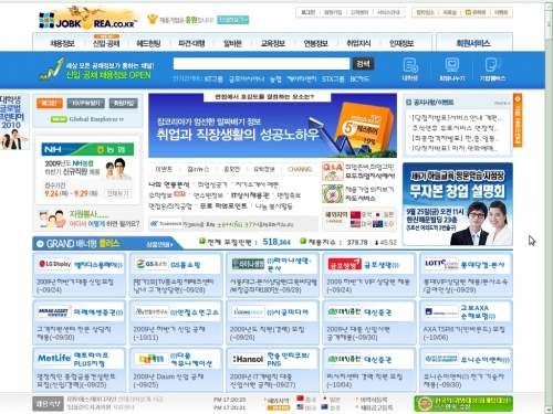
Korea is the land of 99% Internet connectivity for its users. However, it is also the land of ugly web sites. Its sad to say, but it is true. It is as if most Korean web designers opened up a book of best practices in web site design, went down the list, and did the opposite of every single suggestion. Confusing, flash-based menus, unnecessary blinking, extremely small fonts and a million links on one page hurt the eyes. Javascript and HTML tricks that are designed to hide the destination URL of a link and prevent it from being displayed in the address bar are the norm. Korean web site designers love ActiveX controls, even though they only work with Microsoft Windows and Internet Explorer. And visitors to even supposedly respectable, mainstream web sites can download a virus or trojan program through an advertisement listed on the page, which begins cluttering up their computer with useless programs an pop-up advertisements even as it compromises system security and perhaps adds the computer to a growing botnet.
The World Wide Web is built with HyperText Markup Language (HTML), and this language was specifically designed to be easy, open, and accessible to both automated systems and human users alike. But on the Korean peninsula it has become a tool for obfuscation, eye-strain and headaches. Without getting too technical, here are some major points that Korean web sites could follow to make their sites more accessible and useful to the average visitor. While Korean web users might be used to the status quo, if Korean companies are interested in making web sites that people from other countries can tolerate, and even enjoy, then they should follow these points.
First Comes Layout
Layout is a very important part of any design, but especially part of web site design. Since web sites are always about information, they should present their information in the best way possible. Information must be presented clearly, cleanly, and intuitively so that it can be read by the most amount of visitors. Korean web sites usually try to cram as much information as they can into four or even five tightly-squeezed columns of information. If a user has an older monitor, say with a resolution of 800x600, this information can become frustratingly illegible. And since one or two of these columns seem to contain flashing, scrolling advertisements, it can actually make someone physically sick when trying to concentrate on tiny text while yet another k-pop star dances like mad a few pixels over. Korean web site designers should consider putting less things on a given page, and giving it more white space. This creates a calm, clean atmosphere like the page of book, allowing visitors to absorb the information quickly and easily.
Then Leaves Flash
Flash is an over-used practice all over the Internet, not just in Korea. The Web was built on HTML, which is a very accessible form of information. It can be viewed in a variety of ways by both computers and people. Search engines such as Google generally sent out automated web crawlers, called spiders, that automatically read and index HTML-based information. However, information contained within a Flash applet, such as a Youtube video, cannot be read or identified by a web spider. If a web site's main menu is also a Flash-based menu, the automated spider cannot read the links in the menu, and cannot even access the rest of the web site. This can be worked around by providing an alternative to the main Flash menu, usually a site map. However, without this workaround, a Flash menu web site is essentially invisible to search engines, and therefore the world. This is basically a death sentence for any web site which is trying to attract visitors. Web sites should take out Flash whenever possible and replace it with standard HTML. Its faster, easier, cleaner, and clearer.
Then Comes a Revolution in Online Presence
This advice is not so useful for web sites that are only interested in communicating with Korean users, because of course Korean users are already used to it. They expect flash animations, not knowing what the next link is pointing to, and the inability to share specific web pages with other people. But for web sites looking to appeal to a wider audience, simply implementing these two simple ideas, they can attract more of the international web surfing crowd, which hopefully gains them a larger measure of success.